Tuesday, June 5, 2012
Adobe Photoshop Lightroom 4 Review
Posted by Lee Yuan Sheng in "Digital Home Software" @ 08:00 AM

Product Category: Photo Post Production and Library Software
Manufacturer: Adobe
Where to Buy: Amazon.com [Full version] [Upgrade] [Digital Download Windows] [Digital Download Mac OS X] (Affiliate)
Price: US$149 for Full, US$79 for Upgrade.
System Requirements: For Windows: Intel® Pentium® 4 or AMD Athlon® 64 processor, Microsoft® Windows Vista® with Service Pack 2 or Windows® 7 with Service Pack 1, 2GB of RAM, 1GB of available hard-disk space, 1024x768 display, DVD-ROM drive, Internet connection required for Internet-based services. For Mac OS: Multicore Intel processor with 64-bit support, Mac OS X v10.6.8 or v10.7, 2GB of RAM, 1GB of available hard-disk space, 1024x768 display, DVD-ROM drive, Internet connection required for Internet-based services.
Specifications: Partial Feature List
Pros:
- Easy to use but powerful workflow
- Good results are fast to achieve
- For Nikon users: Proper colours, finally!
- US$149 price point is hard to ignore
Cons:
- Slow, slow, slow. Performance issues are present
- Expects to be the centre of your workflow; stepping out of it can make things awkward
- It is slow. It bears repeating. Are you sure you want to use that D800 with this?
Summary: Adobe's Lightroom has reached version 4, and we take a look at its two main modules, and how it works for one of the last holdouts against it. There are some performance issues, but it is capable of some great results. The performance issues cannot be overlooked that easily however, and it does cost the software some points in overall usability. The new price point makes it a relative bargain for many, however.
Introduction
Adobe's Lightroom was created as a response to Apple's Aperture, which combined image cataloguing and viewing with a non-destructive image editing portion. This combination has proven to speed up and integrate workflows for many a photographer. Now with Lightroom reaching version 4, how does it fare?
A note about the review and reviewer
Since Lightroom 4 is a fairly deep and complex piece of software, I will not be going through every little thing that is present. Instead, I will review the software as how it works for me: a photographer who has been using a hodge-podge of other tools (namely Faststone Image Viewer, Nikon Capture NX2, and Photoshop CS4) to view, select, tag and edit photos, and add keywords to them.
My current standard workflow is as such:
- Manually copy photos from the day's shoot to a new folder with the appropriate name.
- Use Faststone to tag selected photos.
- Open tagged images in Capture NX2 for basic edits.
- Image is opened in Photoshop as a 16 bit TIFF for more complex processing.
- Web resizing and keywords are then added in Photoshop
It sounds a bit tedious but, in practice, it has served me well enough. Let us see if Lightroom 4 can replace most of this workflow!
When working, I use the keyboard a lot, moving my hand off the mouse whenever possible for greater efficiency. So if I say something is awkward in practice, it means moving the cursor to one point, clicking, then moving back, then clicking, and repeating that process.
User Interface
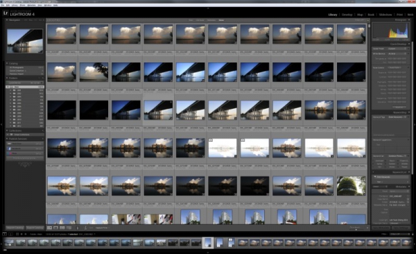
The user interface in Lightroom is pretty consistent. The top part shows the different modules of the software and the bottom part the filmstrip, a horiontal presentation of the photos and videos in the current catalogue. The left and right change based on the module selected, with the left showing previews and file navigation or templates, and the right containing the settings for the module, which is where most of the actions are performed. All four parts can be minimised to extend the real estate of the centre portion. The centre, of course, is the main working area, showing the current task being performed which, again, changes based on the selected module.

Figure 1: The basic view in Lightroom 4.
If you have more than one monitor, you can set the other monitors to act in a number of ways. I have a two monitor setup myself so, for me, the second monitor is set to either the enlarged image preview or to compare two or more images while I work in the main monitor.
Another thing I do quite like is the pop-up notifications when undos/redos are done. It gets my attention, and tells me that the CTRL-Z you just pressed did something, compared to the times I have missed an undo in other editors before.
Overall, it is a decent user interface, and I never had any real major complaints working in it. As with any software, learning the keyboard shortcuts is easer than moving the mouse pointer all over the screen.


