Thursday, September 11, 2008
Visiting Zune HQ for the Zune 3.0 Briefing
Posted by Jason Dunn in "Zune Events" @ 01:10 PM
Along with my fellow Zune MVPs, nine of us in total, I spent Monday September the 8th visiting the Zune headquarters in Redmond, Washington. The MVPs in attendance were Chris Leckness from Got Zune, Patrick Heffner from Zune Tracks, Graham Skee from AnythingbutiPod, Drea from Beetstro, Harvey Chute from Zunerama, Paul Colligan from Zuneluv, Neville Williams from Inside the Circle, Stephan Shipman from Ihaveazune, and me. Here's what I learned about Zune 3.0.
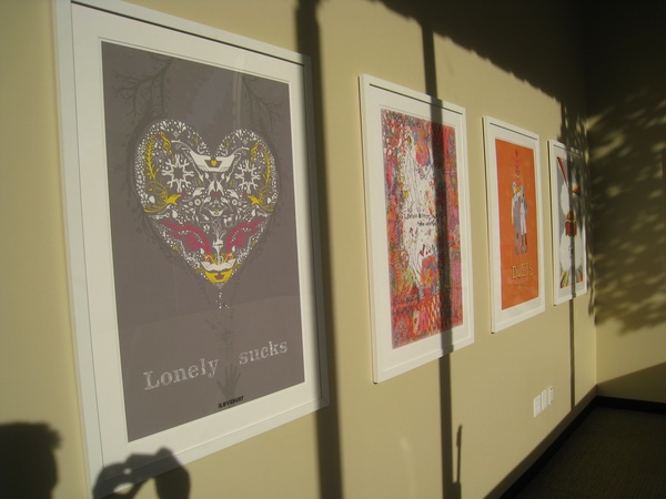
Figure 1: Zune HQ has a lot of cool art hanging on the walls.
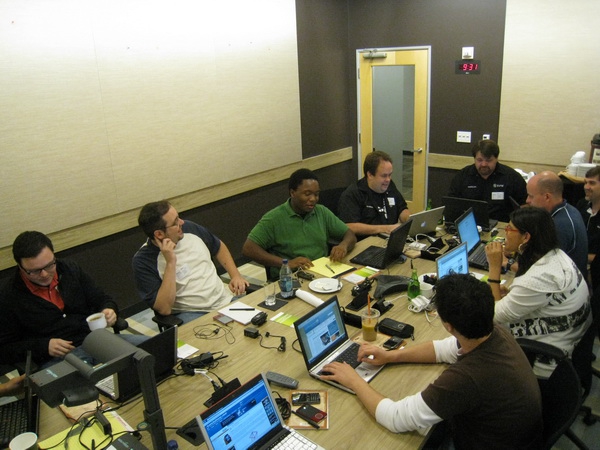 Figure 2: The Zune MVPs getting ready for a day of meetings.
Zune 3.0 Desktop SoftwareDave Jones, Lead Program Manager for the Zune software, kicked off the day by showing us the new Zune 3.0 software. The first thing I noticed was that they updated the look and the feel of the player, just slightly - Jones said that they focused on discovery and making finding new content easier. The design was changed in some subtle ways, including a new white background that makes the experience very sleek-looking. I think the backgrounds offer a bit of extra pizzazz that's fun, but now people have the choice of very plain and stripped down, or the backgrounds that they currently enjoy (along with one new one).
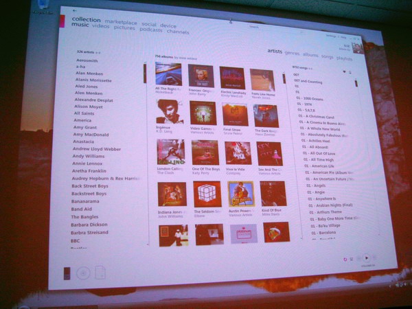
Figure 3: The slightly spruced up look of the desktop software.
The first feature Jones discussed was pretty exciting: Channels. Channels are themed, automatically refreshing subscription playlists. So you can subscribe to the Billboard Top 40 for instance, and constantly get new music. You can update the channel content via a WiFi hotspot, and there are channels like the top songs sold on the Zune Marketplace, partner channels, and others. There's a "Just For You" channel that pulls together content based on the user profile information: as the user rates music with the heart/broken-heart, it uses that information to find similar music that the user would like (think Pandora).
It's based on genres so as you rate more and more of your music, new Channels will appear - at least, that's how I think it works - it will be interesting to see what the threshold is for how many ratings it will take for channels to appear. I also don't know what will happen if your genres are named something different than the genres in the Zune Marketplace - I suspect the channel concept won't work then, which might make me re-name some of my genres. You can rate songs throughout the Marketplace, including music that's not in your collection, which will help you get a broader slice of music than just what you have. This feature obviously depends heavily on having a Zune Pass to get the fullest experience, although some users might enjoy getting music recommendations even if they can only listen to 30 second clips.
There are still no user profiles, so for multi-user families using a Zune Pass there will be some headaches. The problem is that the Zune Pass can still only be linked to one Zune social profile, so as Paul Colligan pointed out, if you're a family of three Zune users, the entire concept of personalized music selections is partially ruined by this limitation. If your 8 year old daughter listens to nothing but the Backyardigans using your Zune Pass account, you'll see that type of content appear in your channels. There's one feature that helps somewhat: there's an option in the ratings for "User personal ratings for each user", which would allow one family member to rate a track without it impacting the ratings of another user.
It's a problem that the Zune team doesn't yet have a solution for, though it seems like the best approach would be to allow one Zune Pass to be attached to up to three Zune Social accounts, and when the software is configured for multi-user use, when it starts up it would ask the user to select which profile they want to use. The Zune team didn't seem to grasp how important the three-Zune functionality of the Zune pass is to families - I've read countless stories of Zune users expressing how grateful they are that they can get unlimited music for three family members for $15 a month. This is an aspect of the Zune that should be highlighted through marketing - it's not just trendy indy hipsters purchasing the Zune, it's moms and dads looking to stretch their entertainment dollars across their whole family.There's a new Marketplace section called "Picks", which gives recommendations for new artists, albums, and songs. There's also going to be a section called "Listeners Like You" - it will be other people part of the Social that you can be friends with, or even just give you the opportunity to explore what a musically like-minded individual is listening to, allowing you to discover new music. You can do this now in a limited way, but it takes a fair bit of clicking. I'm looking forward to this feature, because I've discovered new tracks by artists I enjoy just by looking at other people that listen to the same artists.
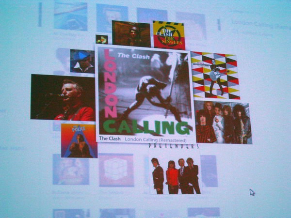
Figure 4: This is what Mixview looks like. It's completely dependent on the speed of the Zune servers, so I sure hope the Zune team upgrades their servers!
When you click on an album on your local hard drive, there's a feature called Mixview that will appear. Mixview is a way to look relationally at albums, meaning it allows you to see the album you clicked on, and other music and people related to that album. Different sized images indicate different things: tiny graphics are friends who listen to the same album, medium-sized graphics are the top listeners from the Social for that album, and large sized graphics are related albums.
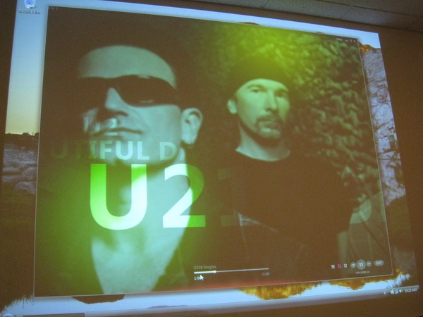
Figure 5: The new Now Playing view - it looks great!
They've enhanced the Now Playing function, and it's quite impressive. When you click on Now Playing, you'll see the grid of album art you're used to seeing in the Zune 2.5 software. After a few seconds, however, that fades away and is replaced by photos of the artist you're listening to. The photos look slightly posterized, and are coloured. Biographical information also floats over the images. If the artist isn't in the Zune Marketplace (say, a local indy band from your city) it won't flip to this view - it will stay on the album art collection view. There's no way to stay on this view if the artist is in the Zune Marketplace however - it will flip to the artist photo view.
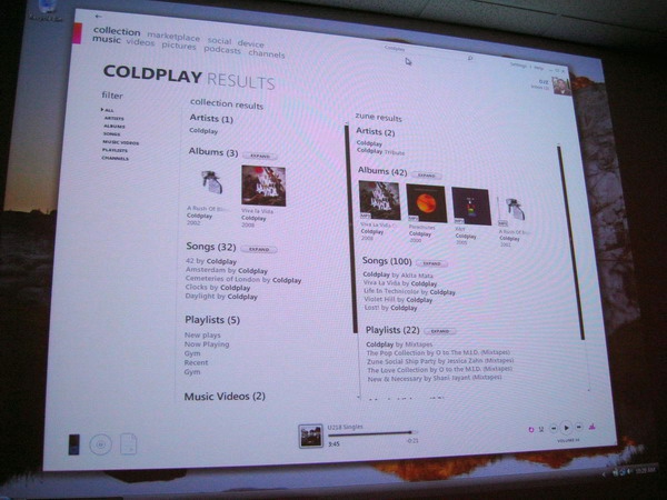
Figure 6: Enhanced search results.
Other notes about the new 3.0 software:
- They've improved the search feature, so as you type it will offer suggestions, which helps with typos or artist names that are difficult to spell;
- There's a new feature that will show tour dates in the Marketplace;
- Type and find was fixed so now if you have nothing selected and start typing, it will find the artist, album, or song;
- You can now purchase points directly inside the Zune software;
- There's an Albums view that will show you bigger album art.
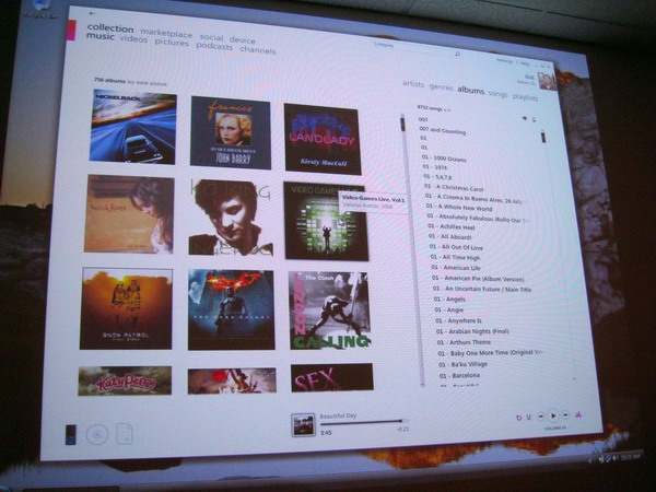
Figure 7: This is the album view, where albums are bigger. I'm a huge fan of album art, so I can see myself using this view quite often.
Dave then walked us through some of the new options in the Settings section of the Zune software. Here are some notes I took:
- When you remove a monitored folder, it will ask the user if they want to remove the content from the monitored folder;
- There's also an option to show duplicates in the software;
- There's a slider bar for graphics, that goes from Basic to Premium. Premium has the full animations;
- There are new backgrounds: Zero, which is a white, Neuxes is a new pattern;
- There's a "Delete All Zune Pass Content" that will nuke all Zune Pass content if you cancel the service;
- There's a "Manual Sync" option that will not delete content on the device if you remove it from the Zune software. This addresses probably the number one complaint.


