Tuesday, May 19, 2009
Talk About Overkill on the Branding...
Posted by Jason Dunn in "Digital Home Talk" @ 01:10 PM

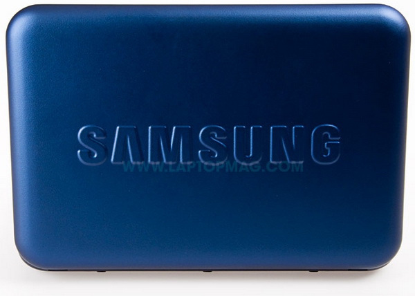
I was checking out a review of a new Samsung netbook, the N310, and was struck by its impressive design - until I saw the photo above. I mean, WHAT THE HELL? Is Samsung so deluded that they believe people would want to have a product that looks like it was designed by a corporate marketing department? Why on earth would they make the logo so enormous - and, adding insult to injury, it looks like it's embossed. Bleh. I tend to admire Samsung's design language across their products quite a bit, but this was some sort of bizarre netbook lid experiment gone awry. Make that logo about 80% smaller, put it down in the left or right corner, and remove the embossing...and this would be a nice-looking netbook. As it stands now, this grotesque lid design is worthy only of mockery.


