Thursday, June 24, 2010
Flickr Announces New Look to Site
Posted by Lee Yuan Sheng in "Digital Home News" @ 05:00 PM
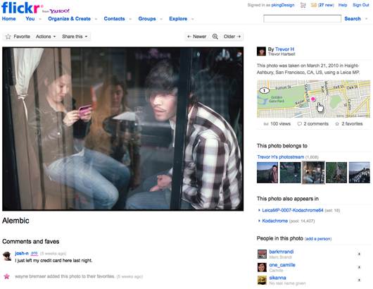
"For over six years, you’ve made Flickr the place to be for photos. Billions of photos of the places you’ve been, the things you’ve seen, and the people in your lives. It’s an amazing photographic record that continues to amaze us. So as part of our Ongoing Quest to Make Flickr More WonderfulTM, we’d like to introduce… a new photo page!"

I'm not sure how many of our readers use Flickr, but I do, despite the ironical fact that it's not such a great platform for ACTUALLY viewing photos. The default click to enlarge a photo from a thumbnail brings you to a photo that's... 500 pixels wide. In a time when 1680x1050 screens are cheap and common, and most last generation panels being 1280 pixels wide, 500 pixels is not very big. Flickr doesn't help by having a fairly cluttered layout (not customisable as far as I know) that jams info alongside the photo instead of below it.
So Flickr's big announcement is now, they will be moving forward to a new larger default size for photos! It will be in glorious...
640 pixels.
I don't know what to say. I personally feel a bit insulted; that a small bump in pixel width is going to be the Next Best Thing on Flickr. There's still information-related stuff being squeezed next to the photo. Can we have some proper large sizes to choose from, like a 1024 pixel default for the longest side, as well as some dynamic layouts? Look at YouTube: They now have a clever set of scripts that lets you chose to enlarge the player so it spreads across the whole top panel and adjusts the layout accordingly. Can we have something like that?
Another nice change I was looking forward to is the slideshow environment. Click on the photo and you will be brought to a viewing environment free of clutter and on a black background; very nice. Execution fails a bit though. To flip between photos you need to use the two very tiny arrow keys on top of the page. I was expecting some script that lets me click on anywhere on the left and right of the background to accomplish that. Oh, and Large is still limited to 1024 pixels at the longest side. It feels like Flickr staff work on 1024x768 monitors.
I'm now left wondering if this is the difference between getting bought up by Yahoo! and getting bought up by Google.
- Read
- Discuss [3 replies]
- Permalink
- Source: PhotographyBLOG


